Luna Rossa
Web Design (UX/UI)
Luna Rossa is a jewellery brand founded by Melissa Daes. At the core of the brand is the idea of creating an eclectic space where well-designed and high-quality pieces of jewellery come together in a mixed array of styles. The team designs and curates pieces sourcing them from manufacturers around the globe. The brief was a re-design of their website since the old one wasn’t achieving the expected results.
Content
Before starting designing the wireframes, we spent some time focusing on the content and how this would be displayed across the site to ensure all the areas were covered.
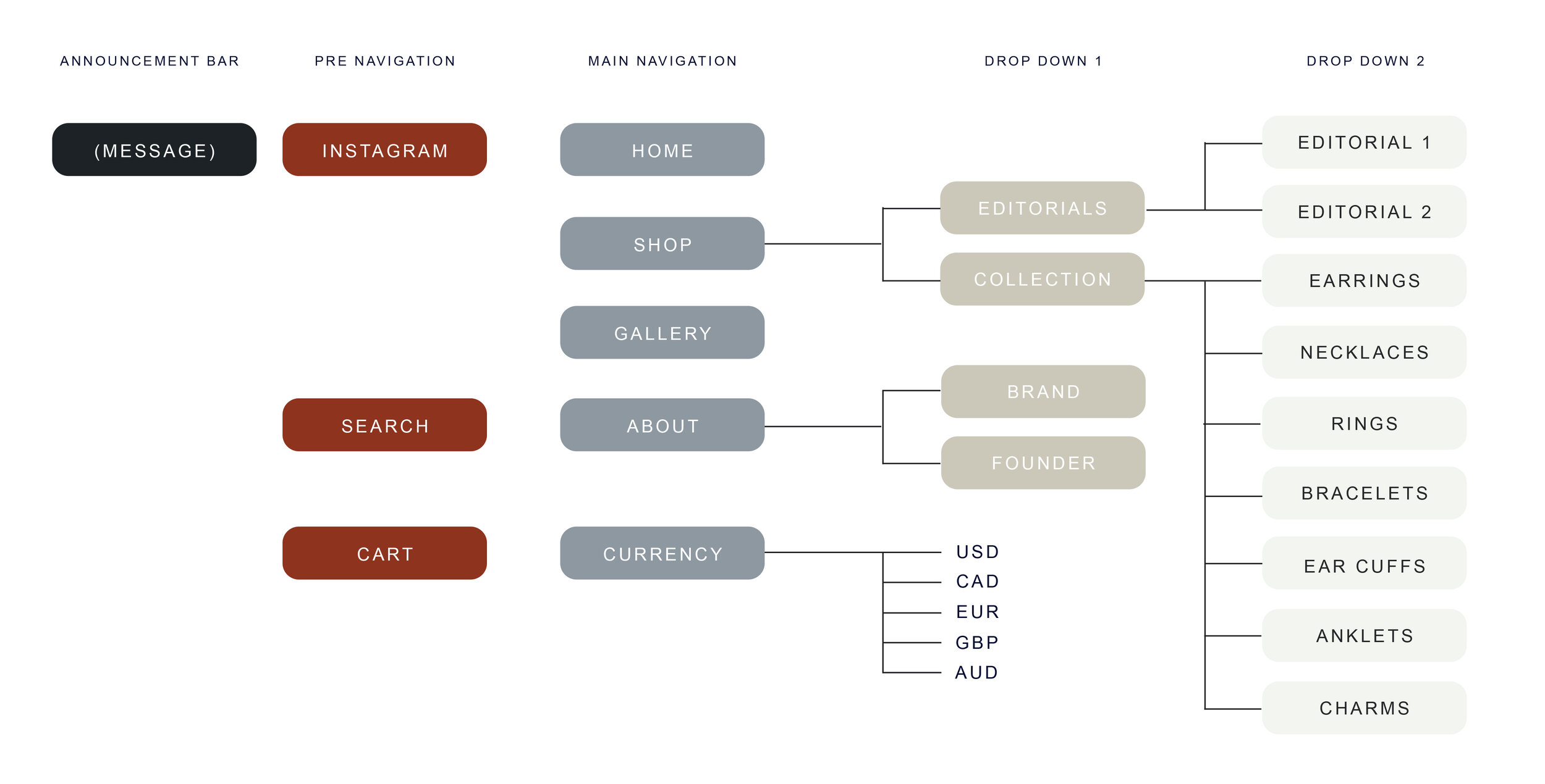
UX Map
In order to establish the site architecture a UX map was created highlighting the different levels where the information would be placed, making sure the user journey was as smooth and clear as possible.
Wireframes
The design of the wireframes was a key part in the process, this determined how links would work and the different touch-points to access to categories and individual products. Green links would direct visitors to categories whereas blue ones would do it to single products, these last ones were located on the second half of the page since it’s always a better option to direct visitors to categories where more products are shown.
Homepage
The design of the homepage was based on the wireframes, the colour palette and fonts were selected following existing brand guidelines to create consistency across all the channels.
Mobile Experience
The whole website was optimised to create the best experience possible on mobile devices, this was done by scaling sections down to adapt to small screens, creating carousels and changing the distribution of images slightly to minimise the page length and avoid long scrolls.
Main Navigation
The main navigation contained three different styles depending on the tab:
Shop: Hyperlinks +image | About: Images side by side | Currency: Hyperlinks
Shop The Look
This section was added at the bottom of the page just before the footer. The idea was creating an effect similar to instagram where you could see products highlighted within an image and buy them from there. We used a carousel featuring 3-5 different images/products that needed a push or were high in demand.
Newsletter
With the aim to acquire new subscribers we had different touchpoints where the customer could sign up for Luna Rossa’s newsletter: Pop up (desktop & mobile) and Sign up form (footer).
Results
Since the new design of the site we noticed an increase in conversion rate which meant that visitors were spending more time on the site and also ending their visit with a purchase.


