
Dr Sam’s
Web Design (UX/UI)
Dr Sam’s is the culmination of two decades’ work, transforming the lives of skin-stressed patients to help them regain their confidence and freedom with clear, brighter skin. Founded in 2018, Dr Sam’s cuts through the noise of skincare shopping where customers are faced with too many choices and over-hyped claims. She’s removed the guesswork by creating a one-stop solution with next-generation formulas inspired by her unique clinic protocols.
The Project
Rebuild of their existing Shopify Plus store to improve user journeys, ensuring their customers had a unique experience, that was dependent on their skincare preferences. We developed and integrated a skincare quiz, bundling feature, and subscription service to take this store to the next level.

Discovery Phase
Stakeholder Interviews → Business Goals → Site Content Analysis → Competitor Analysis → Apps & Integrations
Stakeholder Interviews
The first stage of this project was being able to understand where the company was at that moment from various touch points within the business. I had the opportunity of having 1:1 interviews with key stakeholders, allowing me to introduce the whole UX/UI process and explain how the dynamic and pace of the project was expected to be in order to have the best possible experience working together.




Bussines Goals
After the stakeholder interviews, a workshop took place to find out what areas needed improvement, linking this to company short and long term goals and finding solutions to help general site improvement.

Focusing on NEW VISITORS, introducing Dr Sam’s brand and products through the homepage sections.
Improving customer journey for EXISTING CUSTOMERS by having an always visible search bar.
Educating the audience, offering information about SKIN CONCERNS and recommending products to use.
Showcasing SOCIAL PROOF by customer testimonials (88% of consumers trust online reviews).
Promoting uptake in SUBSCRIPTIONS, highlighting the benefits of the offering.
Encouraging users to read the BLOG as a source of knowledge and expertise in the filed.
Site Content Analysis
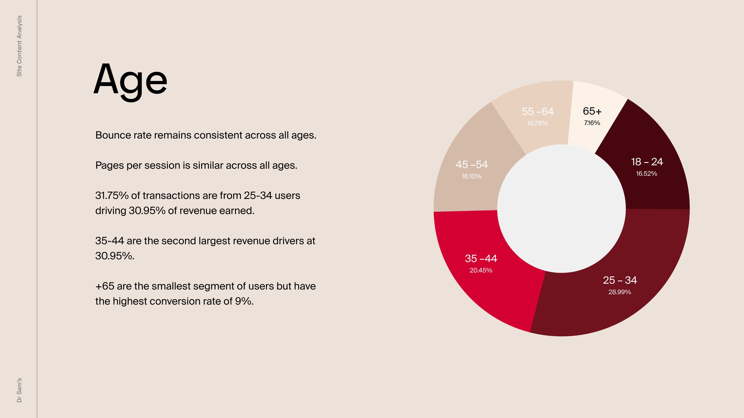
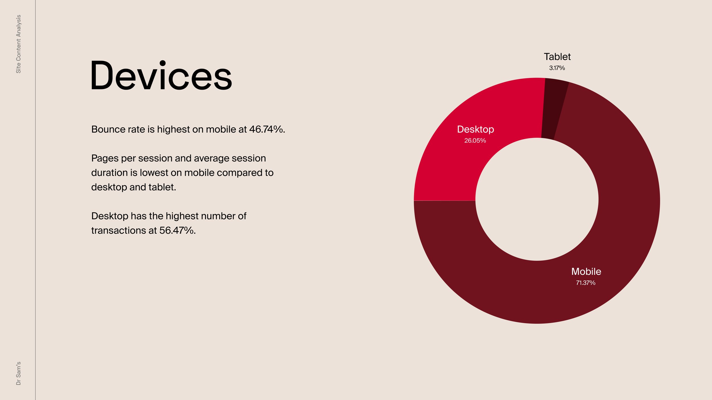
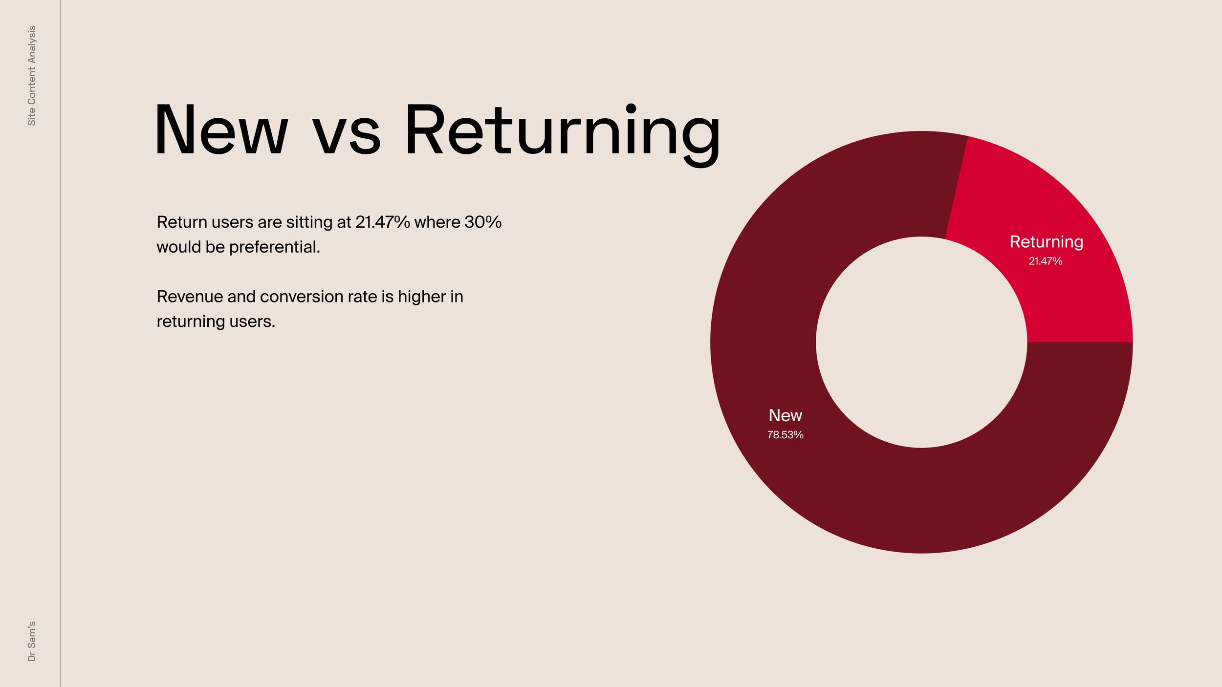
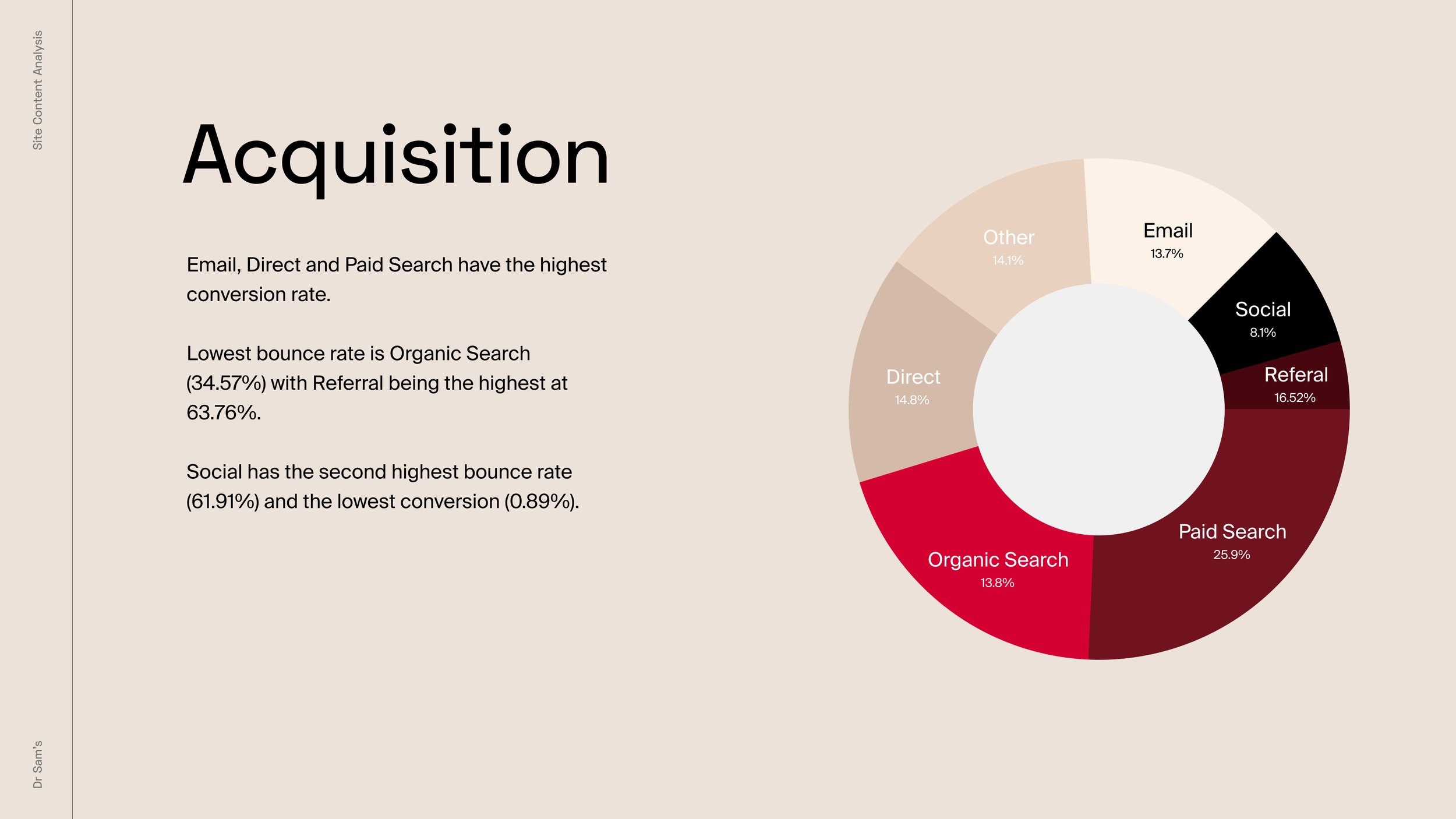
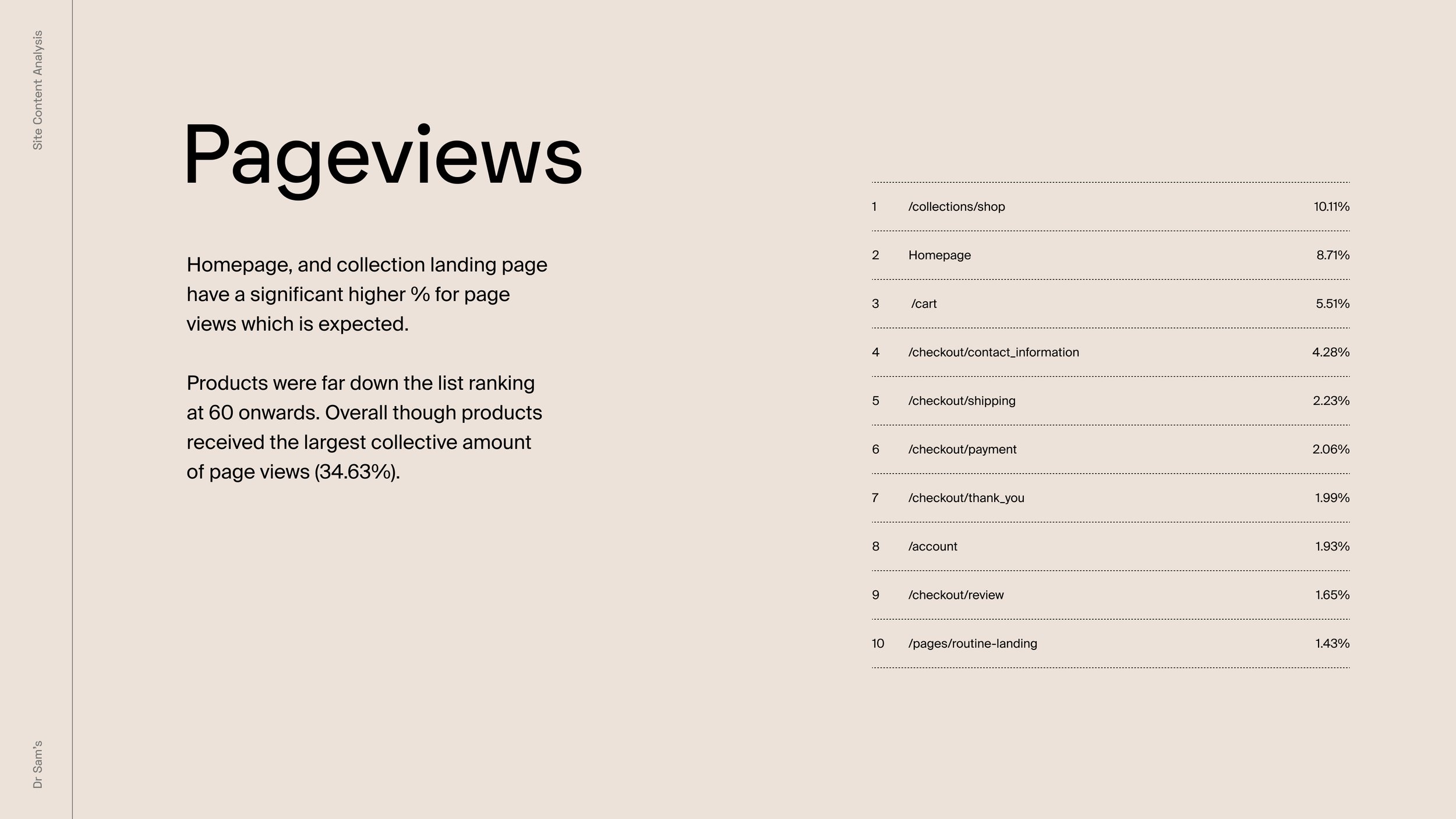
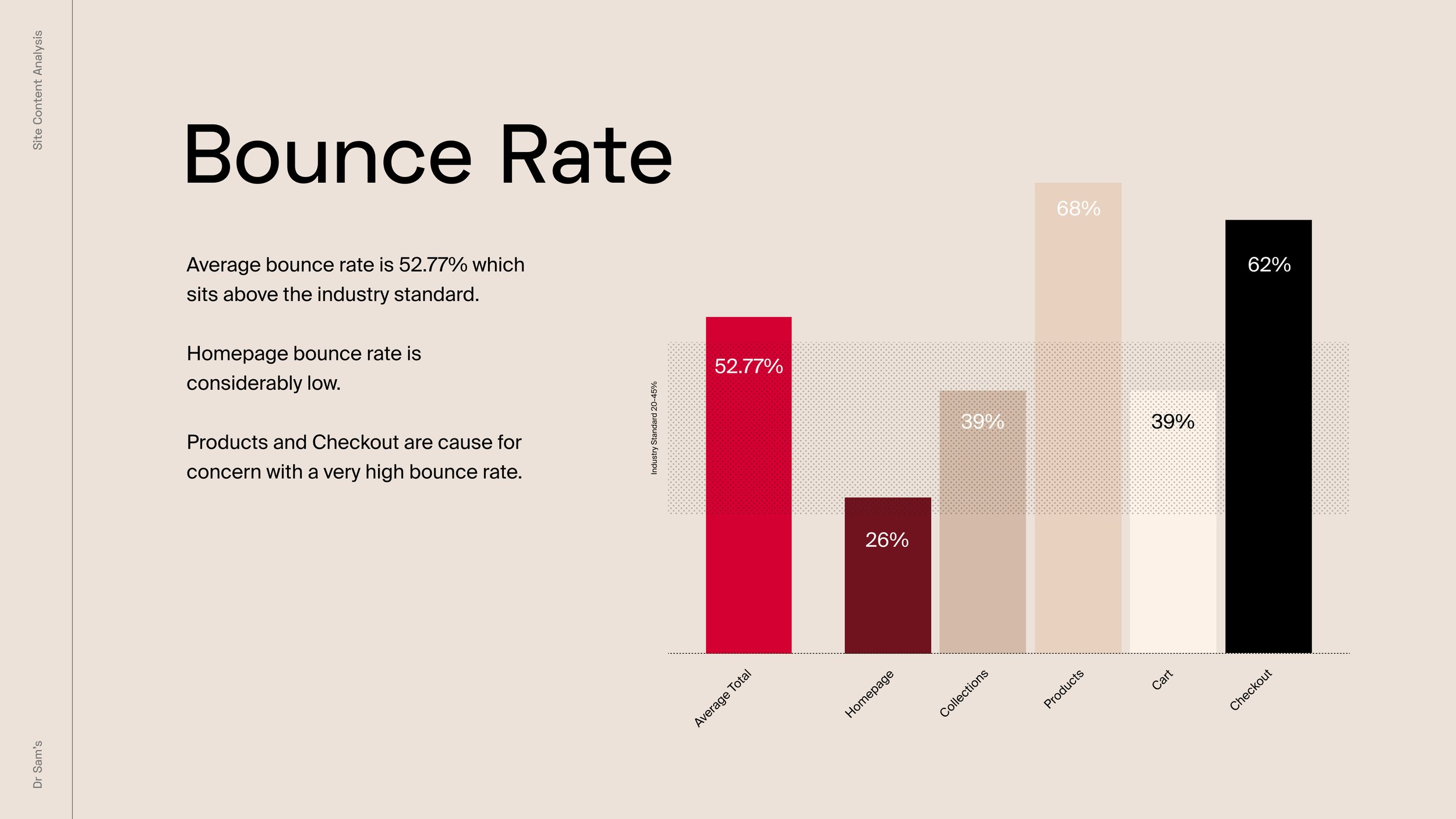
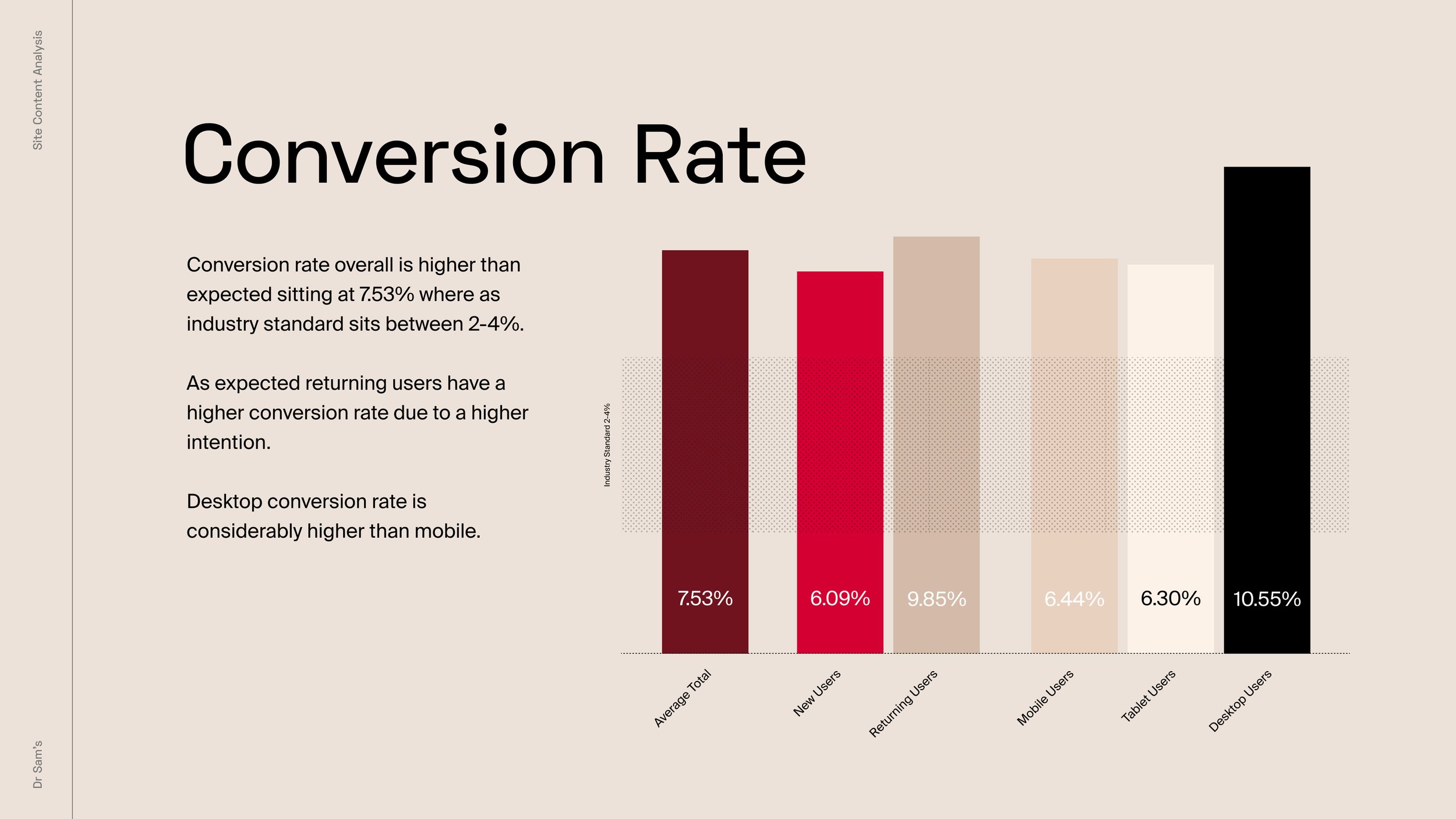
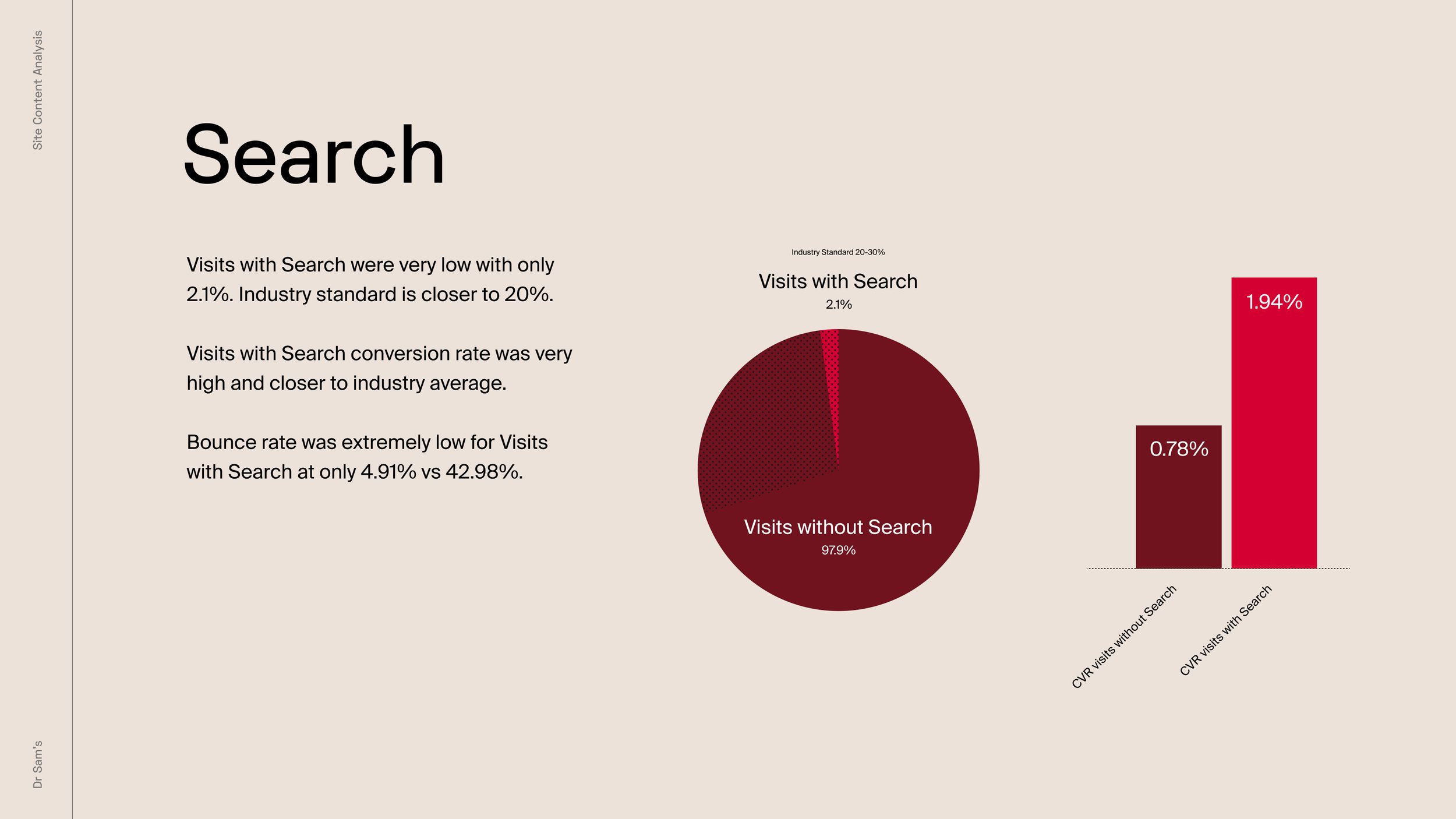
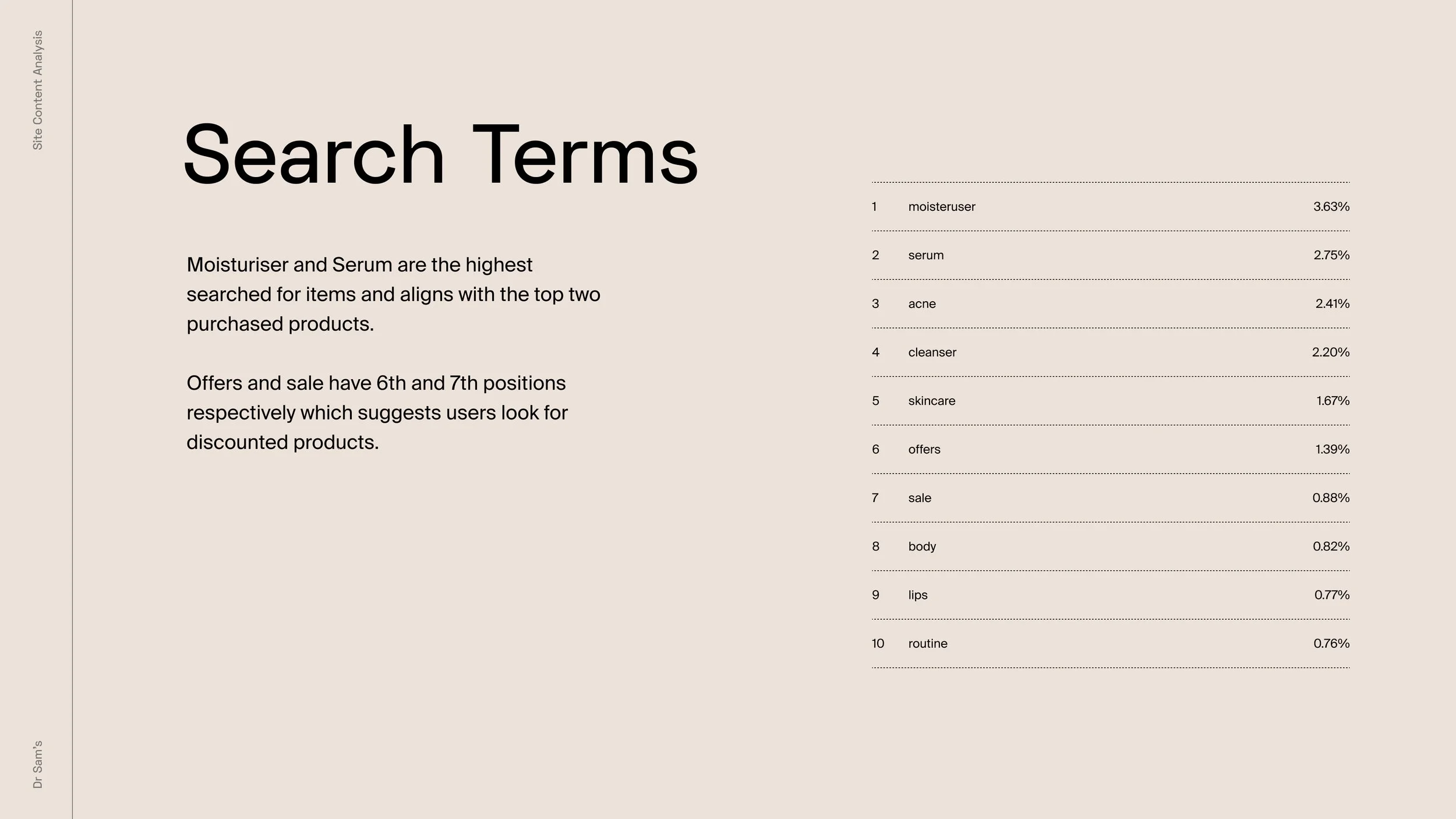
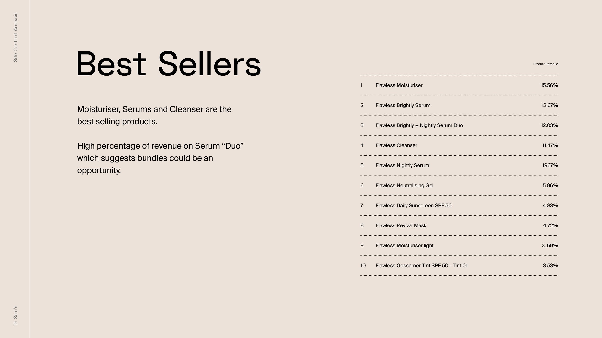
Understanding how the old site was performing was key prior to developing any UX solution. The areas covered in the research were: Age, Gender, Devices, New vs Returning Customers, Page Views, Bounce Rate, Conversion Rate, Search and Search Terms. The tool used was Google Analytics.

Competitor Analysis
After visiting and studying competitor’s sites there was a clear understanding of what was the standard practice and leading approaches. Below there is a list of key areas/features that competitors were doing specially well.
-

• Pictures for categories on mega navigation
• Filters by concerns and ingredients
• “Find the right product” modal on hp
• Skin type on PLP product cards
• “Complete your routine” cross-selling products on PDP
• Effective results page form routine finder
-

• Big customer reviews/quotes
• Vertical navigation, product images displayed per categories
• Interactive PDP
-

• PDP Information
• Brands highlight as a secondary navigation
-

• Category carousels on homepage
• Carousels and hovering effect on PLP
• Size selector on PLP with quick add to bag
• Great user experience on PDP introducing related kits
• Bundles on PDP
-

• Homepage section blocks for product highlights
• USP highlight and about on homepage
• Quotes from press
• Product highlights on mega navigation
• Awards and sets section on PDP
-

• Our philosophy section on homepage
• Concerns section and consultation quiz
• PLP banners promoting product/services
Apps & Integrations
In order to achieve the best results and customer experience different apps were integrated, helping the site to gain a high level of performance and personalisation. The areas that needed to be covered were the following ones: Subscriptions / Points & Rewards / Product Recommendations / Customer Reviews / Search & PLP Filters.


UX Phase
UX Map
The UX map was designed as a method of visualising the entire end-to-end user experience, this was also a useful guide to have a clear understanding of the amount of pages that needed the be designed. The map shows how each piece of content strategically relates to and supports the customer journey.
-
→ Homepage
→ Search Results
→ Product Listing Page
→ Product Display Page
→ Routine Finder
→ Bundle Builder
→ Rewards
→ Blog
→ Create Account
→ Sign In
→ Cart Page
→ Checkout
-
→ Shopify Page
→ Gift Card Redemption
→ Subscriptions LP
→ FAQ’s
→ Contact Us
→ 404
-
→ Skin Concern LP
→ Doctor LP
→ Clinic LP
→ Sign Up Page
-
→ Sign Up
→ Multi Country
→ Cookie Banner
Wireframes
These included the most basic content and visuals, also helped map out the shell of the interface, its screens and basic information architecture.


UI Phase + Delivery
Style Tiles → High Fidelity Designs → Stakeholder Feedback → Technical Specifications → Handover to Developers
Style Tiles
Before starting with high fidelity designs, there was en exploration on styling where a few components were created following the brand guidelines. This step was really helpful to find out what were the client’s preferences regarding visual language and UI elements. The outcome after feedback dictated the direction to take to start designing.

High Fidelity Designs
The designs were based on a spacious, readable, informative, authoritative, lively, attention-grabbing, human, product-centric approach. The focus was on some key areas such as subscriptions, bundle builder and routine finder since these features were the ones that would create more revenue. It was also important to assist customers in selecting a well-defined scope by showcasing top level categories and featuring a diverse sample of products directly ion key pages.
Tech-Specifications
After finalising each page a technical specification document was written specifying functionalities and interactions in detail for the development team. These documents contained a full description of every page including user journey, potential variations etc. We used “Notion” to manage this communication designer-developer as a platform to be able to post comments and questions targeting specific areas.


Results
✔ Increase on men’s audience ✔ Increase on searches ✔ Subscriptions ✔ High blog engagement ✔ Better conversion rate ✔ Customer satisfaction


